

Credit Card Fraud Detection
Labeling anonymized credit card transactions as fraudulent or genuine.

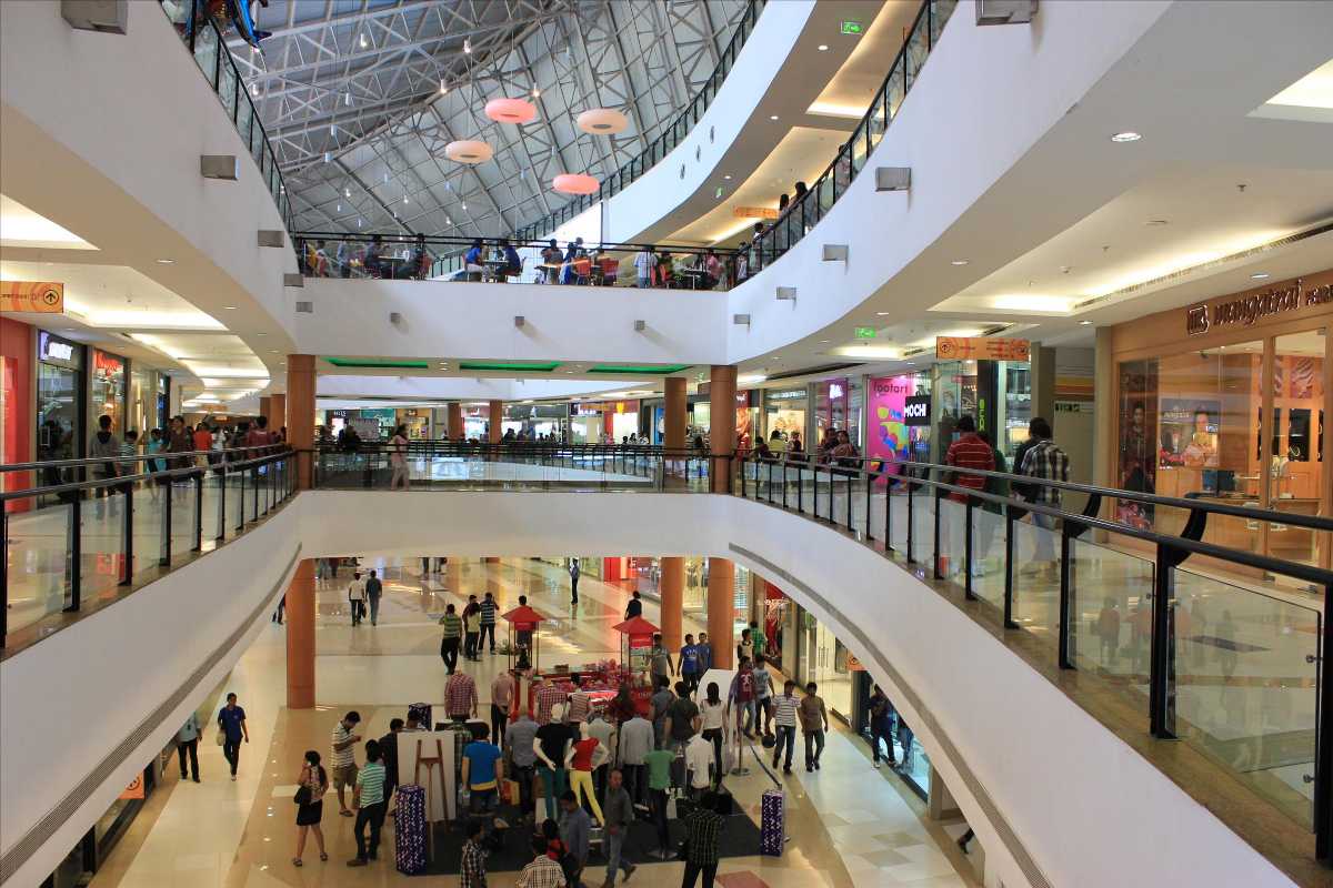
This dataset is obtained from this link on kaggle. It gives us basic information about the customers visiting a mall. Each customer has a unique identification number. We have metrics for their average income, spending score, age and gender.
Our goal in to use this data to provide useful insights and tips to the marketing department. We will try to use unsupervised learning to create clusters and try to understand the intricacies. At the end we aim to give some possible value to the mall and its businesses.
To check out the complete code on github click here.
| CustomerID | Gender | Age | Annual Income (k$) | Spending Score (1-100) | |
|---|---|---|---|---|---|
| 0 | 1 | Male | 19 | 15 | 39 |
| 1 | 2 | Male | 21 | 15 | 81 |
| 2 | 3 | Female | 20 | 16 | 6 |
| 3 | 4 | Female | 23 | 16 | 77 |
| 4 | 5 | Female | 31 | 17 | 40 |
# Returns number of rows and columns of the dataset
df.shape
(200, 5)
Looks like our database contains 200 customers.
# Returns different datatypes for each columns (float, int, string, bool, etc.)
df.dtypes
CustomerID                 int64
Gender                    object
Age                        int64
Annual Income (k$)         int64
Spending Score (1-100)     int64
dtype: object
Knowing the data types is important to plan further exploration and future modeling. Lets run some more code to dive deeper.
# Returns true for a column having null values, else false
df.isnull().any()
CustomerID                False
Gender                    False
Age                       False
Annual Income (k$)        False
Spending Score (1-100)    False
dtype: bool
We have confirmed that we have no data missing. Moving on to the next stage.
# Creating the copy of dataset
df_copy = df.copy(deep=True)
df_copy.head(3)
| CustomerID | Gender | Age | Annual Income (k$) | Spending Score (1-100) | |
|---|---|---|---|---|---|
| 0 | 1 | Male | 19 | 15 | 39 |
| 1 | 2 | Male | 21 | 15 | 81 |
| 2 | 3 | Female | 20 | 16 | 6 |
# Dropping the column of 'CustomerID' as it does not provide any value
df_copy.drop('CustomerID', axis=1, inplace=True)
df_copy.columns
Index(['Gender', 'Age', 'Annual Income (k$)', 'Spending Score (1-100)'], dtype='object')
# Loading essential libraries
import matplotlib.pyplot as plt
import seaborn as sns
df_copy.columns
Index(['Gender', 'Age', 'Annual Income (k$)', 'Spending Score (1-100)'], dtype='object')
# Visualising the columns 'Gender' using Countplot
sns.countplot(x='Gender', data=df_copy)
plt.xlabel('Gender')
plt.ylabel('Count')
Text(0, 0.5, 'Count')

Gender plot - Observation
From the Count plot it is observed that the number of Female customers are more that the total number of Male customers.
# Visualising the columns 'Age' using Histogram
plt.hist(x=df_copy['Age'], bins=10, orientation='vertical', color='red')
plt.xlabel('Age')
plt.ylabel('Count')
plt.show()

Age plot - Observation
From the Histogram it is evident that there are 3 age groups that are more frequently shop at the mall, they are: 15-22 years, 30-40 years and 45-50 years.
# Visualising the columns 'Age', 'Spending Score (1-100)' using Scatterplot and Jointplot
sns.scatterplot(data=df_copy, x='Age', y='Spending Score (1-100)', hue='Gender')
sns.jointplot(data=df_copy, x='Age', y='Spending Score (1-100)')
<seaborn.axisgrid.JointGrid at 0x7efbcac63910>


Age Vs Spending Score - Observation
1. From the Age Vs Spending Score plot we observe that customers whose spending score is more than 65 have their Age in the range of 15-42 years. Also from the Scatter plot it is observed that customers whose spending score is more than 65 consists of more Females than Males.
2. Also, the customers having average spending score ie: in the range of 40-60 consists of age group of the range 15-75 years and the count of Male and Female in this age group is also approximatly the same.
# Visualising the columns 'Annual Income (k$)', 'Spending Score (1-100)' using Scatterplot and Jointplot
sns.scatterplot(data=df_copy, x='Annual Income (k$)', y='Spending Score (1-100)', hue='Gender')
sns.jointplot(data=df_copy, x='Annual Income (k$)', y='Spending Score (1-100)')
<seaborn.axisgrid.JointGrid at 0x7efbc0a3fed0>


Annual Income Vs Spending Score - Observation
From the Annual Income Vs Spending Score plot we observe that there are 5 clusters and can be categorised as:
a. High Income, High Spending Score (Top Right Cluster)
b. High Income, Low Spending Score (Bottom Right Cluster)
c. Average Income, Average Spending Score (Center Cluster)
d. Low Income, High Spending Score (Top Left Cluster)
e. Low Income, Low Spending Score (Bottom Left Cluster)
# Selecting 'Annual Income' and 'Spending Score' as the features for clustering
X = df_copy.iloc[:, [2,3]]
X.columns
Index(['Annual Income (k$)', 'Spending Score (1-100)'], dtype='object')
# Calculating WCSS values for 1 to 10 clusters
from sklearn.cluster import KMeans
wcss = []
for i in range(1,11):
  kmeans_model = KMeans(n_clusters=i, init='k-means++', random_state=42)
  kmeans_model.fit(X)
  wcss.append(kmeans_model.inertia_)
# Plotting the WCSS values
plt.plot(range(1,11), wcss)
plt.title('Elbow Method')
plt.xlabel('Number of Clusters')
plt.ylabel('WCSS')
plt.show()

From the above plot it is observed that 5 clusters are optimal for the given dataset.
from sklearn.preprocessing import StandardScaler
scaler = StandardScaler()
X = scaler.fit_transform(X)
Feature Scaling is performed because KMeans uses Distance (Euclidean, Manhattan, etc.) and the model perfoms faster on scaling the values
# Training the KMeans model with n_clusters=5
kmeans_model = KMeans(n_clusters=5, init='k-means++', random_state=42)
y_kmeans = kmeans_model.fit_predict(X)
# Visualising the clusters
plt.scatter(X[y_kmeans == 0, 0], X[y_kmeans == 0, 1], s = 30, c = 'yellow', label = 'Cluster 1')
plt.scatter(X[y_kmeans == 1, 0], X[y_kmeans == 1, 1], s = 30, c = 'cyan', label = 'Cluster 2')
plt.scatter(X[y_kmeans == 2, 0], X[y_kmeans == 2, 1], s = 30, c = 'lightgreen', label = 'Cluster 3')
plt.scatter(X[y_kmeans == 3, 0], X[y_kmeans == 3, 1], s = 30, c = 'orange', label = 'Cluster 4')
plt.scatter(X[y_kmeans == 4, 0], X[y_kmeans == 4, 1], s = 30, c = 'red', label = 'Cluster 5')
plt.scatter(x=kmeans_model.cluster_centers_[:, 0], y=kmeans_model.cluster_centers_[:, 1], s=100, c='black', marker='+', label='Cluster Centers')
plt.legend()
plt.title('Clusters of customers')
plt.xlabel('Annual Income')
plt.ylabel('Spending Score')
plt.show()

Clustering - Observation
Using this clustered data its a few ideas how it can be used:
a. High Income, High Spending Score (Cluster 5) - Target these customers by sending new product alerts which would lead to increase in the revenue collected by the mall as they are loyal customers.
b. High Income, Low Spending Score (Cluster 3) - Target these customers by asking the feedback and advertising the product in a better way to convert them into Cluster 5 customers.
c. Average Income, Average Spending Score (Cluster 2) - Can target these set of customers by providing them with Low cost EMI’s etc.
d. Low Income, High Spending Score (Cluster 1) - May or may not target these group of customers based on the policy of the mall.
e. Low Income, Low Spending Score (Cluster 4) - Don’t target these customers since they have less income and need to save money.
In short our project of using Unsupervised Learning and clustering the customeres into groups can help in highly optimizing the use of marketing money. This would save a lot of time and money and would also increase sales.
Be sure to check out my socials linked below, and feel free to ask me anything. And with that peace out!
Labeling anonymized credit card transactions as fraudulent or genuine.
Story of this blog and why it exists, There's a reason to the madness.


